
The Complete Guide to Mobile-First Website Design
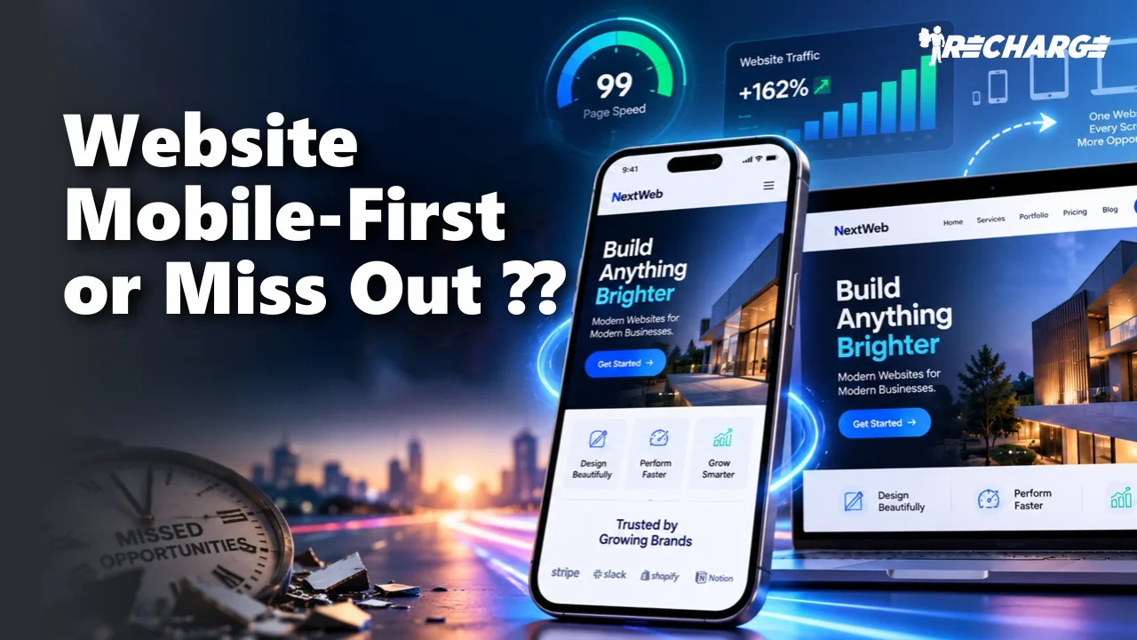
Think about the last time you visited a website on your phone. If the page loaded slowly, the text was difficult to read, or you had to zoom in just to click a button, you probably left.
That is exactly why mobile-first website design has become so important for modern businesses.
People use their phones to search for products, compare services, read reviews, fill out forms and contact businesses. A website that works beautifully on a desktop but feels frustrating on a mobile screen can easily lose potential customers.
Mobile-first design starts with a simple idea: design the website for smaller screens first, then expand the experience for larger devices.
It is not just about making a website responsive. It is about thinking carefully about how people browse, read, click and convert when they are using a phone.
What is mobile-first website design?
Mobile-first website design means designing the mobile experience as the starting point rather than treating it as a smaller version of the desktop website.
On a desktop, there is plenty of screen space. You can use wide banners, multiple columns, large navigation menus and several visual elements at once.
A phone gives you much less room.
That forces businesses to focus on what really matters.
A good mobile-first approach prioritises:
- Clear and readable content
- Simple navigation
- Touch-friendly buttons
- Fast-loading pages
- Easy-to-use forms
- Responsive layouts
- Important information above unnecessary visual elements
This doesn’t mean desktop users get a poor experience. The same website can adapt to tablets, laptops and larger screens through responsive web development.
The difference is that mobile users are considered from the beginning rather than being an afterthought.
Why does mobile-first website design matter for businesses?
A mobile-friendly website can directly affect how people interact with your business.
Imagine someone searching for a local service while travelling. They find your website through Google, but the phone number is difficult to find and the contact form doesn’t work properly on mobile.
They may simply go back to the search results and choose another business.
This is particularly important for service businesses, ecommerce brands, startups and local companies where a website visit can quickly turn into a call, enquiry or purchase.
Google also uses the mobile version of a site’s content for indexing and ranking in its mobile-first indexing system. That makes the mobile experience an important part of modern SEO.
For businesses, mobile-first design can support:
- Better user experience
- Stronger mobile SEO
- Lower frustration
- Better engagement
- Easier conversions
- More consistent brand experiences
A strong website should make it easy for a visitor to understand what you offer and take the next step.
Mobile-first design and responsive web design are not exactly the same
These terms are often used together, but they describe slightly different ideas.
Responsive website design means a website adjusts its layout according to the screen size. A responsive page can adapt to mobile phones, tablets, laptops and desktop monitors.
Mobile-first design is a design strategy. It starts by considering the limitations and needs of mobile users before expanding the experience for larger screens.
The two approaches work very well together.
For example, a business website might start with a single-column mobile layout. On a larger screen, that same layout could become a two- or three-column design.
The content remains useful, but the presentation changes based on the device.
This is why businesses looking for professional responsive web design should think beyond simple screen resizing. The experience should remain easy to use at every stage.
Speed and Core Web Vitals should be part of the design
A beautiful website is not much help if users have to wait for it.
Mobile users may be browsing on slower networks or older devices, so unnecessary scripts, oversized images and heavy animations can create a poor experience.
This is where Core Web Vitals become important. Google’s current web performance guidance includes metrics such as Largest Contentful Paint (LCP), Interaction to Next Paint (INP) and Cumulative Layout Shift (CLS).
A practical mobile website optimisation process should include:
Optimise images
Use appropriately sized and modern image formats where suitable. Avoid uploading huge images when a smaller version can provide the same visual quality.
Reduce unnecessary code
Large JavaScript files and unnecessary third-party scripts can affect loading and interaction performance.
Keep layouts stable
Visitors should not see buttons or text suddenly move while the page is loading.
Improve interaction
Buttons, menus and forms should respond smoothly when someone taps them.
Performance should be considered during mobile-first website development, not only after the website is launched.
Mobile UX can make or break conversions
Getting visitors to your website is only half the job. You also need to make it easy for them to take action.
Think about a typical service website. A visitor may want to:
- Understand the service.
- Check whether the business is trustworthy.
- See pricing or benefits.
- Ask a question.
- Submit an enquiry.
If every step requires effort, conversions can suffer.
Good mobile UX design removes unnecessary friction.
Use buttons that are easy to tap. Keep forms short. Make phone numbers clickable. Avoid tiny text. Keep important information visible without forcing users through several unnecessary pages.
This becomes even more important when the website is connected to paid advertising. If someone clicks an ad on their phone and lands on a difficult page, the advertising budget can be wasted.
For businesses looking at the wider relationship between design and marketing performance, Recharge Studio’s digital marketing services can help connect website experience with broader acquisition strategies.
How to create a mobile-first website that works
There is no single layout that works for every business. A local clinic, ecommerce store and B2B company will have very different customer journeys.
Still, a few principles work across industries.
Start with the most important content
Ask what a mobile visitor needs first. Put that information where it is easy to find.
Simplify navigation
Avoid overwhelming visitors with too many menu options. Use clear labels and logical categories.
Design for touch
Buttons and interactive elements should have enough space to use comfortably without accidental clicks.
Keep forms simple
Only ask for information that is genuinely needed at that stage of the customer journey.
Test on real devices
A page that looks fine in a desktop browser does not always feel right on an actual phone.
Check accessibility
Readable text, sufficient contrast, meaningful labels and keyboard-friendly functionality help create a better experience for more users.
A professional website should also be reviewed after launch. User behaviour, analytics and conversion data can reveal where mobile visitors are dropping off.
Mobile-first website design is also a business investment
Website design should not be treated only as a visual exercise.
A good mobile experience can support SEO, user satisfaction, lead generation and conversion rate optimisation at the same time.
For example, improving a mobile landing page could make it easier for a visitor to understand an offer and submit an enquiry. That small design improvement can have a bigger business impact than adding another decorative element.
Businesses can also connect their website with lead generation strategies so that traffic has a clear purpose.
For brands running social campaigns, the same principle applies. A user clicking from Instagram or another platform will often reach the website on a mobile device. Your social media marketing strategy should therefore consider the experience after the click, not just the post or advertisement itself.
A website should continue the conversation that started on the marketing channel.
Build a Mobile-First Website with Recharge Studio
A mobile-first website should do more than simply fit a smaller screen. It should be fast, easy to navigate and designed to turn mobile visitors into customers. At Recharge Studio, we combine website design, development, SEO and conversion-focused strategies to build websites that support real business goals.
From responsive layouts and mobile UX to page speed, Core Web Vitals, technical SEO and conversion optimisation, our team focuses on creating a smooth experience across devices. Whether you need a new website or want to improve an existing one, we can help you create a mobile-friendly digital experience that supports both visibility and growth.
Conclusion
Mobile-first website design is no longer simply a design trend. It is a practical way to build websites around how people actually browse today.
The best approach combines responsive layouts, fast performance, simple navigation, accessible content and conversion-focused UX. It also considers SEO from the beginning rather than trying to fix mobile problems later.
If your website feels difficult to use on a phone, it may be time to review more than just its appearance. Look at speed, navigation, content, forms and the complete customer journey.
If you’re planning a new website or improving an existing one, you can explore Recharge Studio’s multi-channel marketing work or contact the team to discuss your requirements.
FAQs
What is mobile-first website design?
Mobile-first website design means creating the website experience with mobile users as the starting point. Designers first consider smaller screens, touch interactions, content priorities and performance before adapting the experience for tablets and desktops.
Why is mobile-first website design important for SEO?
Google uses the mobile version of a website’s content for indexing and ranking under mobile-first indexing. A well-structured mobile experience therefore helps ensure that important content and functionality are available to search engines and users.
What is the difference between mobile-first and responsive web design?
Responsive web design allows a website to adapt to different screen sizes. Mobile-first design is the strategy of starting the design process with the mobile experience and then expanding it for larger screens. They are often used together.
How can I make my website mobile-friendly?
Start with a responsive layout, readable text, simple navigation, touch-friendly buttons, fast-loading images and mobile-friendly forms. Test important pages on real smartphones and review performance regularly.
How does mobile-first design improve user experience?
It removes common mobile frustrations such as tiny buttons, difficult navigation, slow pages and excessive scrolling. A simpler experience helps visitors find information and complete actions more easily.
Does mobile website speed affect conversions?
It can. Slow pages create friction, especially for visitors arriving from search, advertising or social media. Improving performance can create a smoother experience and give users fewer reasons to leave before completing an enquiry or purchase.
- Published in Development, Mobile